EditText 기능의 확장 TextInputLayout
디자인 감각이 부족한 개발자들은 material design을 참고하여 더욱 나은 UI를 만들 수 있다. 또한, 구글에서는 이를 쉽게 적용할 수 있도록 ‘Android Design Support Library’를 제공하고 있다.
이번에 라이브러리에서 제공하는 기능 중 TextInputLayout을 사용할 기회가 생겨 간단하게 정리해보려 한다.
라이브러리 세팅
우선 다른 라이브러리들과 마찬가지로 gradle에 dependency를 등록한다.
compile 'com.android.support:design:25.1.0'
기본 구현
레이아웃에서 TextInputEditText(또는 EditText)를 TextInputLayout으로 감싸주면 기능들을 이용할 수 있다.
<android.support.design.widget.TextInputLayout
    android:layout_width="match_parent"
    android:layout_height="wrap_content">

    <android.support.design.widget.TextInputEditText
        android:layout_width="match_parent"
        android:layout_height="wrap_content"
        android:inputType="text" />
</android.support.design.widget.TextInputLayout>
힌트 표시
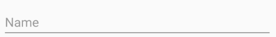
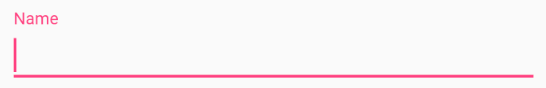
이를 적용하는 방법은 기존과 같다. EditText에 포커스가 잡힐 경우 애니메이션과 함께 첫 번째 이미지에서 두 번째 이미지로 변화하는 것을 확인할 수 있다.
editText.setHint("Name");
카운터 표시
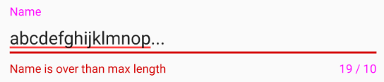
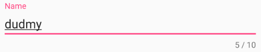
카운터를 적용하면 입력창 우측 하단에 ‘currentLength / maxLength’가 표시된다. 만약 사용자가 입력하다 설정한 최대 길이를 넘어선 경우에는 아래의 이미지와 같이 보이게 된다. 만약 maxLength를 설정하지 않을 경우, currentLength에 대해서만 표시된다.
inputLayout.setCounterEnabled(true);
inputLayout.setCounterMaxLength(10);
에러 메시지 표시
예를 들어 위의 카운터를 적용한 상태에서 10글자가 넘어갈 경우, showMessage()로 에러 내용을 표시할 수 있다. 그리고 사용자가 다시 입력을 시작하면 hideMessage()를 통해서 숨길 수 있다.
private void showMessage() {
    inputLayout.setErrorEnabled(true);
    inputLayout.setError("Name is over the max length");
}

private void hideMessage() {
    inputLayout.setErrorEnabled(false);
    inputLayout.setError(null);
}